Moodboard builder for product direction
Curate image references and build a visual direction board for industrial design and CMF projects. A free moodboard tool on brahm.design.
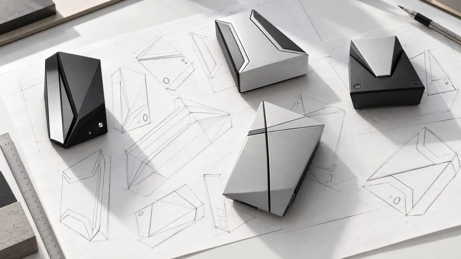
A moodboard is how an industrial designer shows a direction before anyone has committed to a CAD file or a tool. It should be specific enough that a teammate can tell the difference between “quiet medical device” and “outdoor power tool”, and loose enough that it does not pretend to be the final CMF. The moodboard builder is a place to curate image references and arrange a board you can talk through in a review.
Use it when a brief is still open: a new product family, a CMF refresh, or a student project that needs a clear visual thesis. Collect references for form language, colour, material, context of use, and typography or graphic language if the product has a UI or a pack. A strong board is edited. Six to twelve images with a short caption will usually beat a dump of forty screenshots.
The board is a communication tool, not a licence to copy a competitor’s housing. Write down what you are taking from each reference — a radius language, a two-tone split, a hard/soft contrast — so the conversation stays about principles. When you present, lead with the user and the context, then the board, then the implications for manufacture.
Once the direction is agreed, move to the palette builder and the material explorer to turn the atmosphere into a palette and a shortlist of processes. A moodboard that never meets a material and a process is only decoration.
Example
A tight board for a kitchen hand tool. Context: wet hands, morning light, a crowded drawer. Form: a single generous radius, a visibly soft TPE zone where the thumb sits. Colour: warm off-white body, one muted clay accent. Material: glossy ABS would be wrong here; the references should point to a satin, wipeable surface. That is enough to start a sketch series without pretending the product is already designed.
How to use this tool
- Open Moodboard Builder in the Industrial toolkit and start a board for one project, not for your whole portfolio.
- Add references for form, colour, material, and context. Crop tightly so the point of each image is obvious.
- Write a one-line note under each image: what you are borrowing, and what you are leaving behind.
- Edit until the board can be read in thirty seconds. Remove anything that fights the direction.
- Present the board next to the brief, then take the agreed direction into palette and materials work.
Frequently asked questions
Can I upload my own photos?
Yes — your own photographs of objects, finishes and places of use are often more useful than generic stock. Use only images you have the right to use in a private working board.
How is this different from a Pinterest board?
The value is that the board lives next to your palette, materials and briefs in the same toolkit, and that you are asked to caption why each image is there. The software is simple on purpose.
Should clients see the raw board?
Show an edited board. A working collection can be messy; a review board should be readable in half a minute and tied to the brief.
When should I stop adding images?
When a new image no longer changes the story. If two pictures say the same thing, keep the clearer one.