CMF colour palette builder
Build harmonious colour palettes for product CMF — analogous, complementary, split complementary and monochromatic sets. Free on brahm.design.
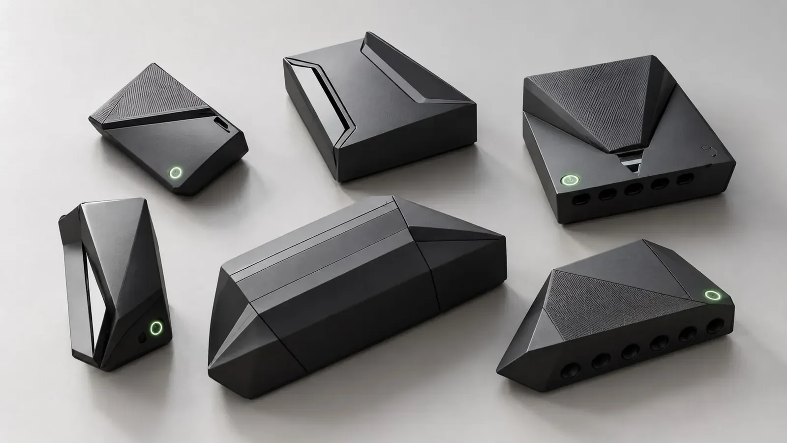
Colour on a physical product is not the same as colour on a poster. A palette has to survive resin tints, anodise lots, painted metal, and the light of a shop shelf or a dashboard. The palette builder in the industrial toolkit is a fast way to generate harmonious CMF palettes from a base colour and a classic relationship — analogous, complementary, split complementary or monochromatic — so you can start a CMF board with intent rather than a random set of swatches.
Use it at the start of a CMF exploration, when you need three to six colours that will sit together on a housing, a soft-good, or a family of accessories. Analogous palettes stay calm and are often right for medical or workplace tools. Complementary and split-complementary palettes give a stronger accent — useful when a brand needs a recognisable latch, cap or interface colour. Monochromatic palettes are a safe way to test value and finish rather than hue.
The builder will not choose a production colour for you. Brand guidelines, material availability, and contrast for typography or indicators still have to be checked in the real finish. A green that looks correct in sRGB can shift on dyed nylon or on a clear-coat over aluminium. Treat the output as a direction, then confirm it against physical samples and, if the product has a UI, against contrast for any printed or painted legends.
Pair this tool with the material explorer and the moodboard so colour, finish and reference images stay in one story. A palette that looks clever in isolation often fails when it meets a gloss level or a texture.
Example
Example direction. A handheld sensor for a clinic: base a warm off-white (housing), analogous soft grey-green (overmould), and a single deeper green accent on the shutter and logo. The palette stays quiet in a medical setting, the accent is findable on a crowded trolley, and both greens can be checked later in TPE and painted ABS samples. That is the kind of small, purposeful set the builder is for.
How to use this tool
- Open Palette Builder in the Industrial toolkit and set a base colour from a brand, a material sample, or a reference image.
- Choose a harmony — analogous, complementary, split complementary or monochromatic — and generate the set.
- Edit any swatch that will not work in the real process (for example a fluorescent that you cannot hold in moulded ABS).
- Note which colour is the body, which is the accent, and which is reserved for interface or safety.
- Export or copy the palette into your moodboard and check it against actual material chips before you lock CMF.
Frequently asked questions
Are the colours in Pantone or RAL?
The builder works in screen colour as a starting point. Production colour should be specified in the system your vendor uses — Pantone, RAL, a resin manufacturer’s colour book, or an anodise code — after you have seen a physical sample.
Can I use this for brand identity work?
You can generate a harmony for a presentation, but brand systems have typography, accessibility and existing guidelines that this tool does not enforce. For product CMF it is a sketching aid, not a brand manual.
Does it check contrast ratios?
No. If a colour will carry text, icons or a warning, check contrast separately against the relevant standard for that surface. CMF contrast on a curved, textured part is also not the same as WCAG contrast on a screen.
Why did my favourite accent disappear after I changed the base?
Harmonies are computed from the base hue. Change the base and the related hues move with it. Lock the accent first if it is a brand colour, and treat it as a fixed swatch rather than a generated one.